From May 2022 to November 2024, I worked as a Communications Officer at the National Centre for Mathematics Education (NCM) in Gothenburg, Sweden. I’d like to share some of the projects and responsibilities I’m most proud of.
Homepage
Love at first sight
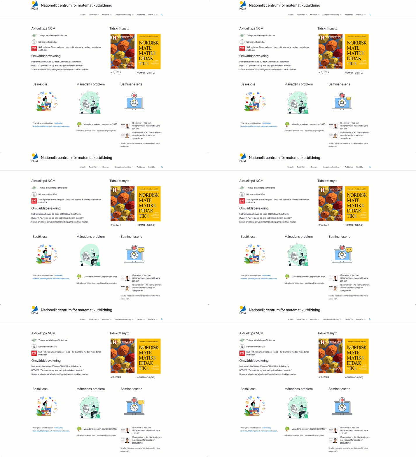
The homepage is the first thing visitors see. It shapes their first impression and reflects how much you value the people visiting your website. During my final year, ncm.gu.se received more than 15,000 visits. Here’s how the homepage looked before I joined the organization, and how it looked after the redesign.
Results
Introduced a bright, spacious visual theme with a cleaner layout, allowing key content such as journals, news and featured resources to stand out.
Recreated the NCM logo as scalable vector artwork.
Automated publication of NCM news, prioritizing featured articles with imagery.
Automated external news monitoring.
Automated the display of the latest issues of Nämnaren and NOMAD as soon as they were published.
Added subtle animations to featured content to give the homepage a more dynamic feel.
Automated updates for the Problem of the Month and Seminar Series, allowing new competitions and events to appear immediately after publication.
Observations
Theme and layout: A light blue theme with a boxed layout. I found the page somewhat busy and visually cluttered.
Logo: The logo appeared blurry and lacked scalability.
Content management: Information about the journals had to be updated manually.
Logo
Colour, typography and form
One of my first discoveries was that our logo appeared blurry. I wanted to improve it—but quickly realized that no original design files existed. There was no PSD, no Illustrator file, no vector graphics, and no documented typography. I recreated the logo from scratch, matching the original as closely as possible while researching the typography used throughout our publications. The result was a fully editable Illustrator file, scalable vector artwork, documented fonts, and a visual identity that can continue to evolve in the future. These are the kinds of projects I enjoy the most: the ones nobody notices, but everyone benefits from.
Kangaroo Mathematics Competition
– What is it?
The Kangaroo Mathematics Competition is an international mathematics competition designed to spark curiosity and enthusiasm for learning. Rather than serving as a traditional exam, it presents engaging and thought-provoking problems that encourage mathematical thinking and inspire classroom discussion. Originating in France, the competition is now held in more than 110 countries, with NCM coordinating the Swedish edition.
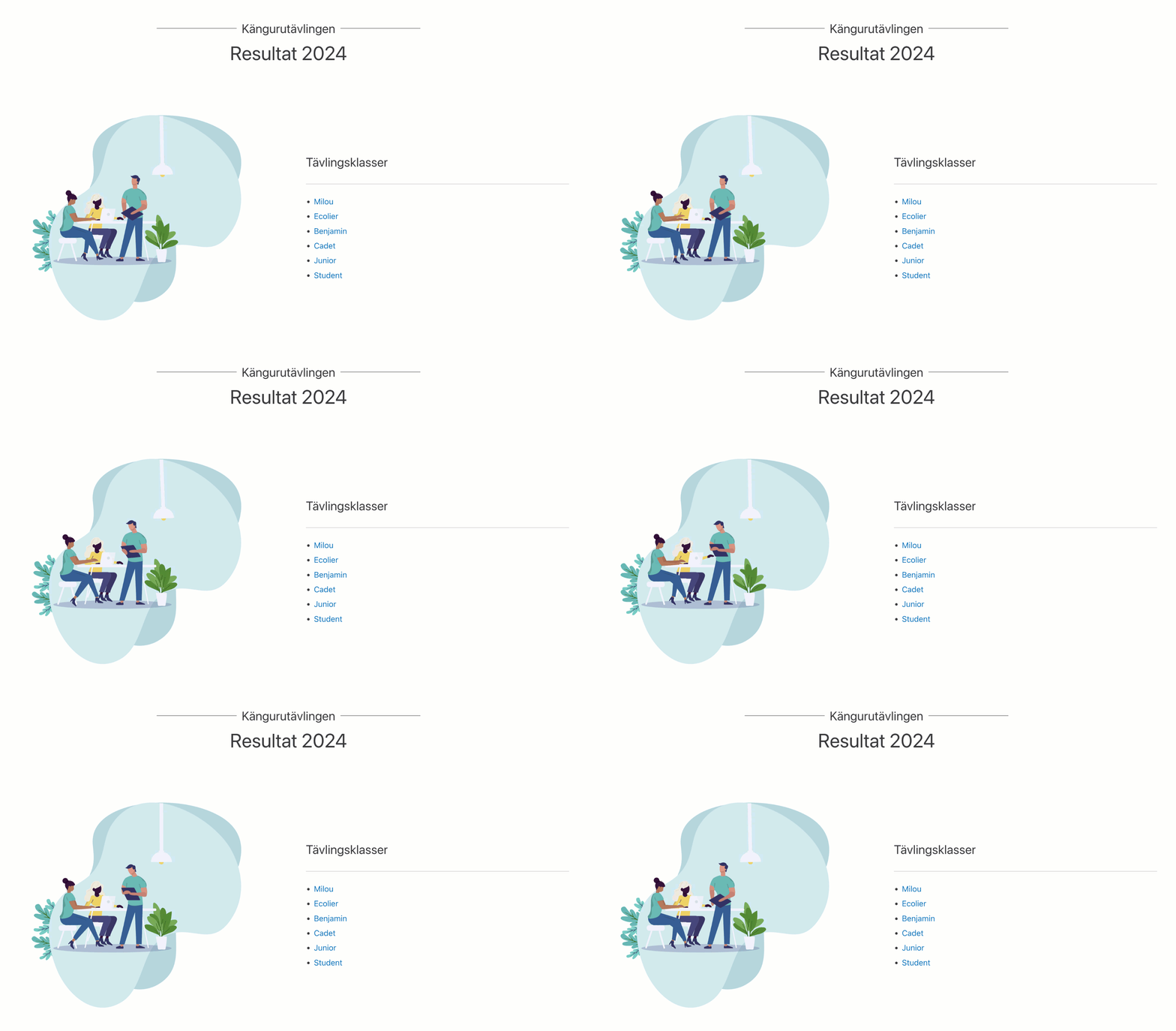
During one year, the competition landing page received 21,186 visits, making it a high-priority improvement project.
My goal was to make it as easy as possible for mathematics teachers across Sweden to find information, understand the process, feel supported, and avoid unnecessary follow-up questions.
Results
Redesigned the landing page with automatically updated statistics and results from previous years.
Wrote clear, comprehensive content explaining the competition, eligibility, timelines and participation.
Designed a new logo from scratch.
Designed three versions of printable certificates to suit different preferences.
Produced an onboarding video explaining registration, downloading materials, running the competition, marking submissions, submitting results and printing certificates.
Modernised the newsletter, allowing teachers to manage their own subscriptions and receive timely updates throughout the competition.
Compiled results from thousands of students and published approved statistics and reports for teachers and guardians.
Observations
Teachers had expressed that they:
Had difficulty finding the competition materials.
Were unsure whether their registration had been completed correctly.
Did not know where to download the materials.
Were uncertain about how the grading process worked.
Needed clearer information about how the competition was conducted.
Diamond Diagnostics
Logo, flowcharts and colour palettes
Diamant Diagnostics is a comprehensive formative assessment framework used by mathematics teachers throughout Sweden.
When responsibility for the material was transferred from the Swedish National Agency for Education to NCM, one of the requirements was to establish a new visual identity.
I was given overall responsibility for redesigning the graphic framework. The challenge was to modernise the visual language while preserving recognition and familiarity for long-time users.
The original logo had several shortcomings:
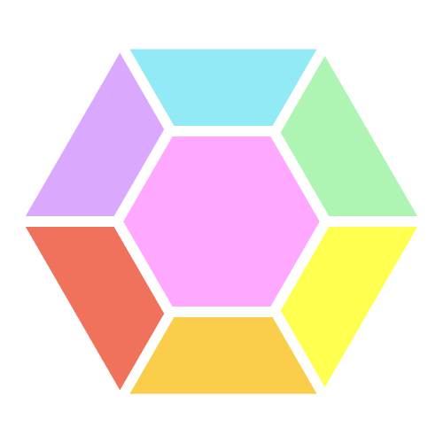
The six facets did not indicate which mathematical area they represented.
The diamond was perfectly round rather than diamond-shaped.
No official colour palette existed.
I redesigned the symbol into a more traditional diamond with six clearly defined facets, assigned distinct colours to each subject area, and explored more than thirty different colour schemes before selecting the final direction.
Seminar series
Live talks and recorded lectures with Sweden’s leading mathematics educators
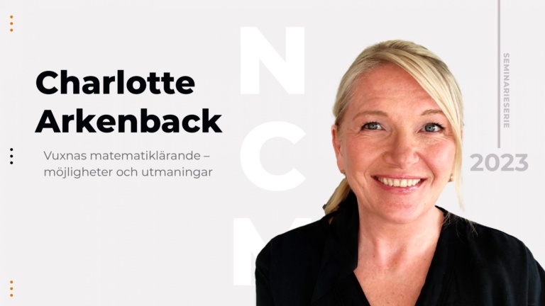
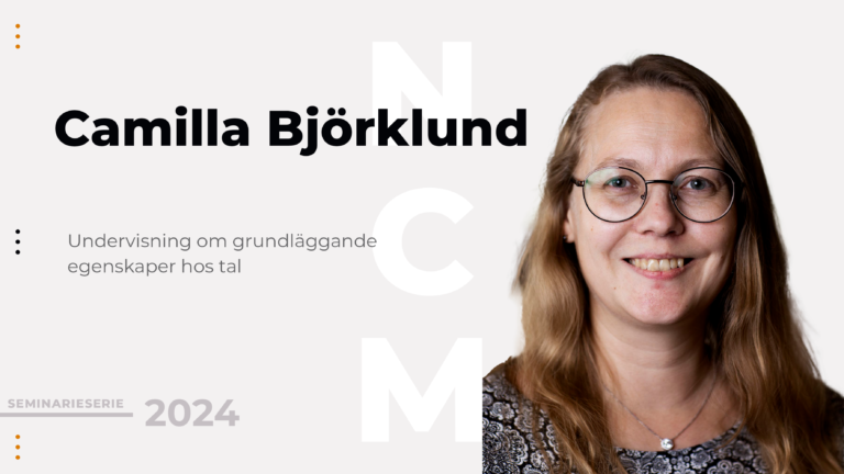
Several times each year, my colleagues and I welcome some of Sweden’s foremost mathematics educators to present their research, teaching methods and latest developments. The seminars are open to everyone and typically attract anywhere from a dozen to more than 300 participants.
I manage the entire production process—from invitations and planning to recording, editing and publishing each seminar. I use Camtasia for screen recording and video editing, and Logic Pro X for audio mixing and mastering.
To make participation as straightforward as possible, I also created a dedicated presenter landing page explaining how the seminars work, what speakers can expect, and practical technical tips to ensure a smooth presentation.